Sole UX Designer, responsible for:
Feb 2023 – Jun 2023
F2Uni is a call management SaaS used by charities, schools and universities across the UK to support their fundraising efforts.
An existing user, a fundraising manager at a leading UK university, reached out to the company to discuss whether we could collaborate to introduce new script functionality to the call screen.
Their student calling team was relying on a paper binder to read scripts during calls, which the fundraising manager observed disrupted conversations with constituents and hindered campaign progress.
My primary objective was to design a call script feature and integrate it seamlessly into the call screen.
I also used this opportunity to identify and address usability issues on the call screen through heuristic analysis and user research, with the goal of improving student caller task efficiency.
when using the new on-screen scripts and improved constituent information structure, helping them stay engaged in conversations.
during the new campaign, suggesting that the new on-screen scripts and streamlined task flows increased caller task efficiency.
as the improved interface and new on-screen scripts made the call process more straightforward, according to the fundraising manager.
I had the initial meeting with the fundraising manager to discuss their goals, pain points and expectations.
-The Fundraising Manager
We have a new campaign coming up soon, and I’m trying to come up with ways to make our workflow more efficient.
-The Fundraising Manager
How might we make the call process more efficient so student callers can focus on the conversations without distractions?
I completed the core tasks on the call screen while comparing it against established usability principles to identify and visualise the potential usability issues that I could solve.
To assess how competing products manage on-screen scripting, I collected examples of competitor UIs by exploring support materials on their websites and reviewing demo and tutorial content on YouTube.
I spoke with five student callers to validate the campaign manager’s assumptions and gain a clearer understanding of their workflows and the challenges they encountered.
I asked them to walk me through their canvassing process while using the existing call screen as a prop.
Participants: 5
Duration: 40-45 min
Participants: 1
Duration: 45 min
I created two user personas to present insights from the interviews and help me stay focused on goals, needs, and challenges of our users.
Student Caller
Grace is a university student hired part-time to make fundraising calls
Fundraising Manager
James is a manager who plans and organises fundraising campaigns, manages student callers and oversees campaign performance
I translated my findings into opportunity statements to guide ideation stage, using the How Might We (HMW) method to encourage open-ended thinking without implying specific solutions.
To reduce the cognitive load, I proposed separating core tasks into dedicated screens arranged in a sequence that aligned with the canvassing workflow captured in the experience map.
The addition of dedicated screens reduced the number of steps needed to complete the tasks.
To meet the budget and time constraints, my approach was to reuse the existing UI design as much as possible rather than create a new one from scratch.
I used Figma’s prototyping tools to add interactivity and ran usability testing with the five student callers I had interviewed earlier.
The goal was to validate that the redesigned layout and on-screen scripting were easy to use and helped callers complete calls faster compared to the existing interface.
We simulated calls and I asked participants to complete three outcome scenarios (donation, refusal, and call rescheduling) using both the existing call screen with the paper script and the redesigned screen.
Due to time constraints, participants completed all three scenarios on the redesigned screen, but only one or two on the existing screen. This approach allowed me to prioritise validating the redesign while still collecting data to compare task efficiency with the existing interface.
Usability testing showed that streamlined task flows and the introduction of on-screen scripting reduced the number of steps needed to complete calls, helping participants move through scenarios more quickly.
Some users struggled to find the call/donation history panel on the redesigned call screen as it appeared below the fold on small screens.
1366 x 768
(2nd most popular desktop size in 2023)
The separate panels on the new screen made it way quicker to find what I needed.
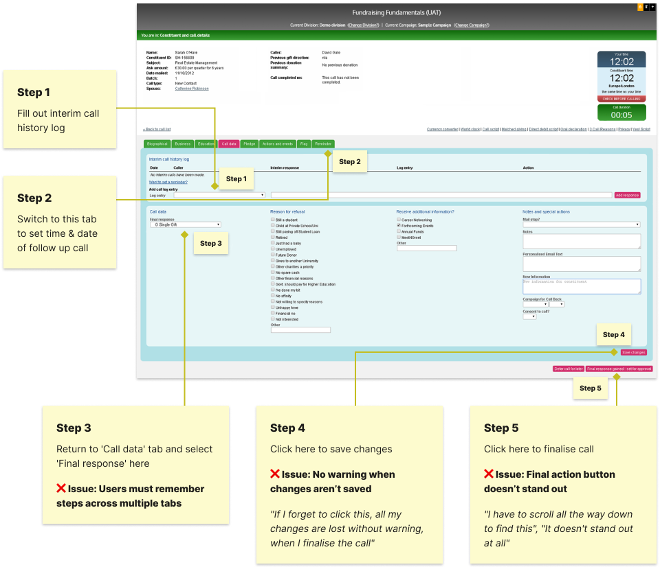
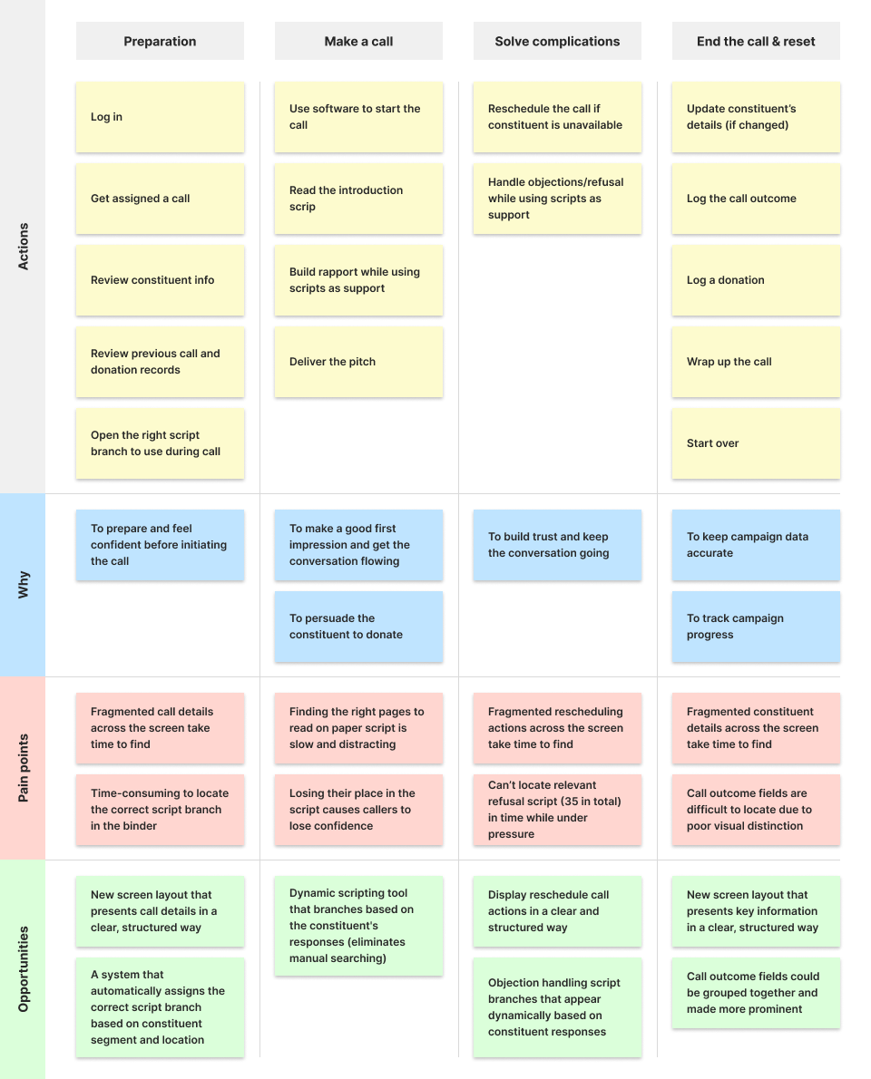
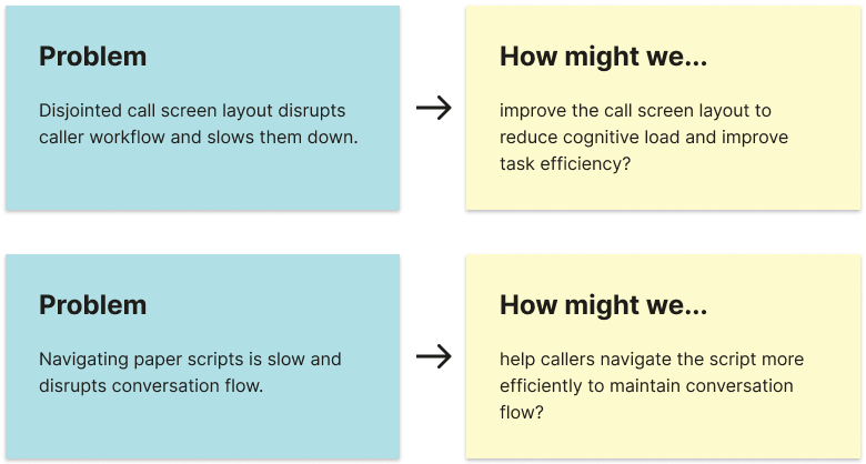
User research found that student callers often lacked confidence and focus during calls. This was largely due to difficulty finding the right script during calls and quickly accessing constituent information before calling, which sometimes stopped them from preparing properly.
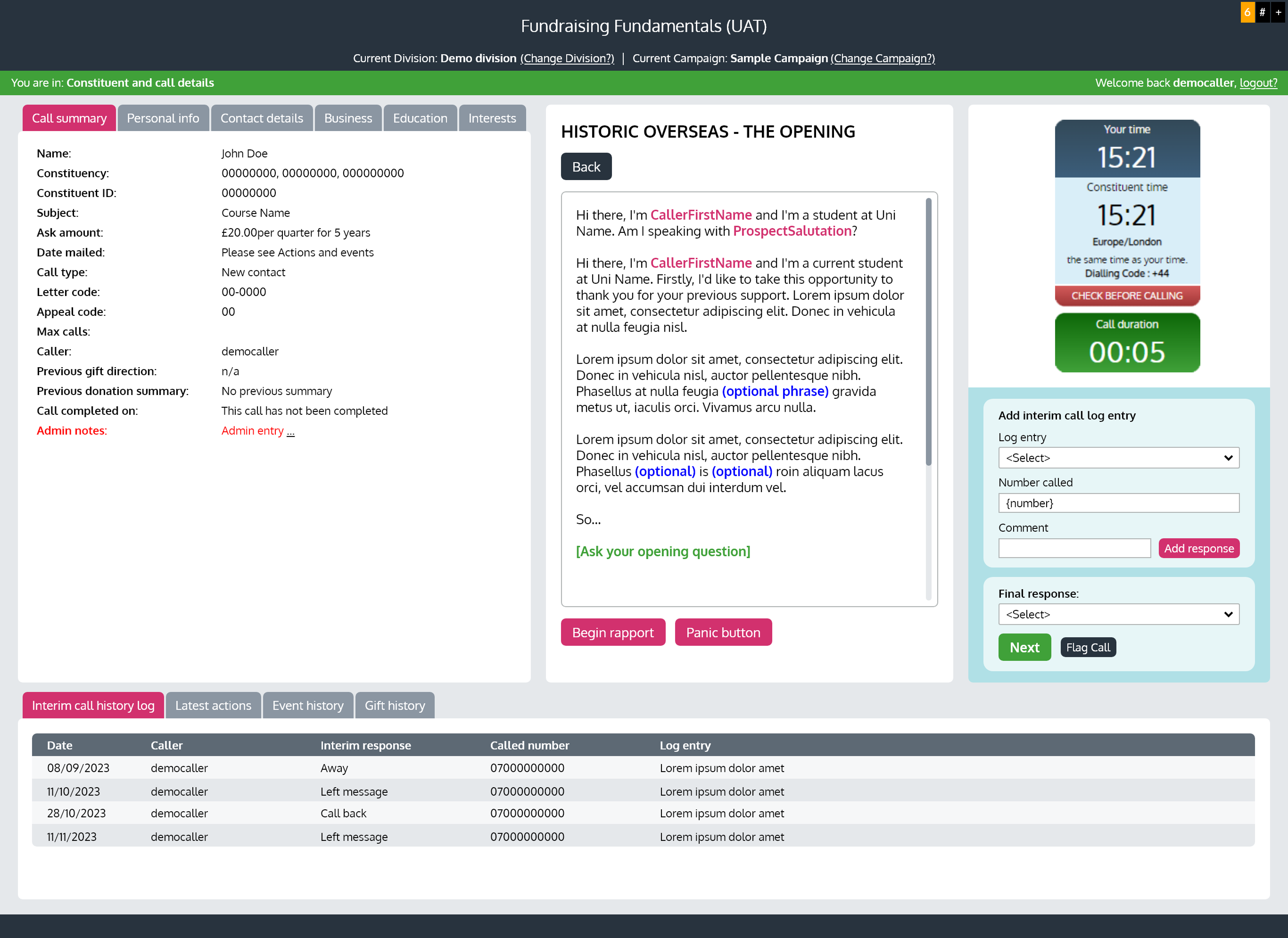
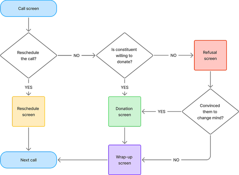
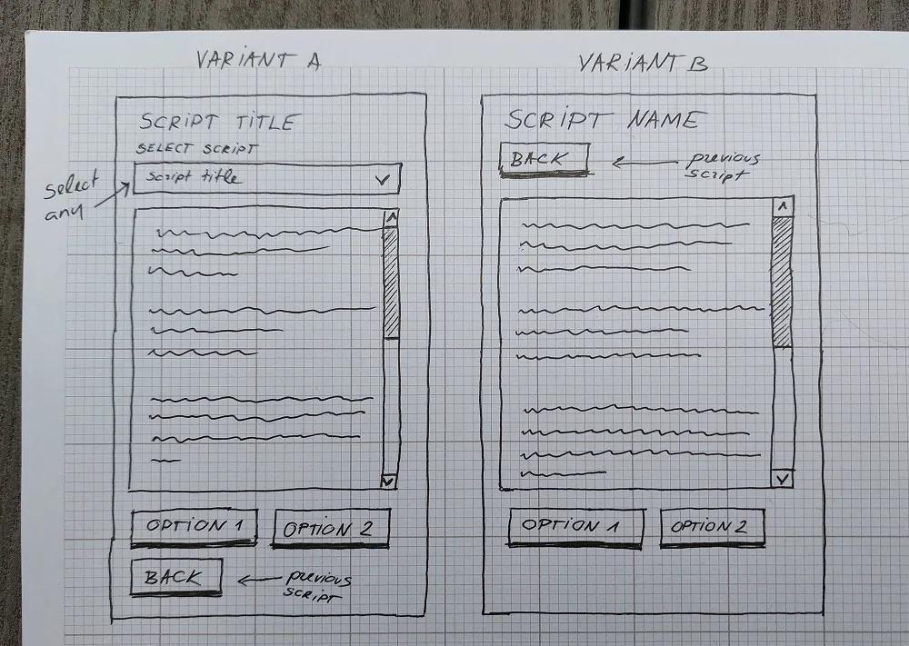
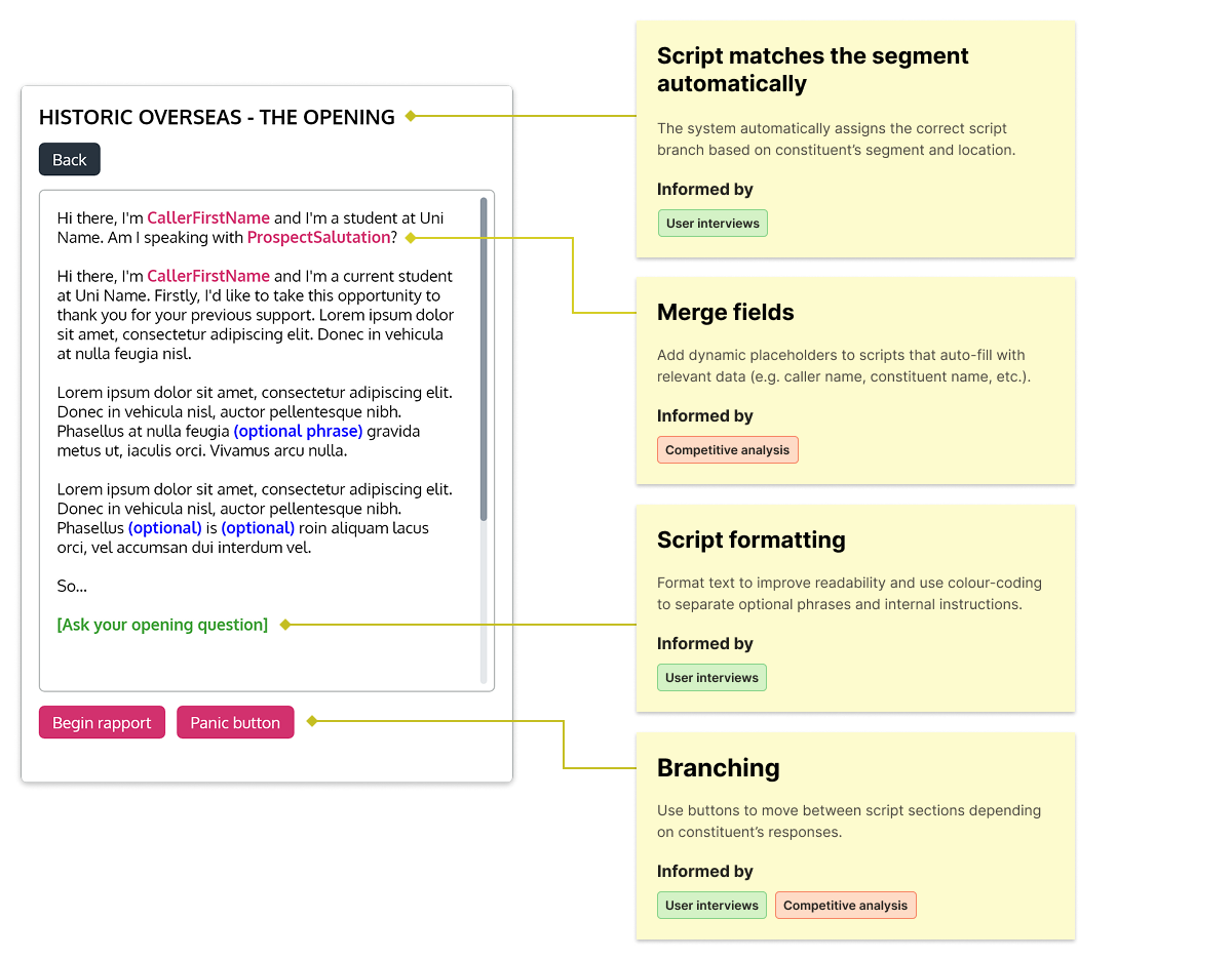
I designed an on-screen script that automatically branched based on constituent’s segment, location and responses during the call, removing the need to search for the right script manually. I also restructured constituent information so callers could find key details more quickly.
Usability testing and post-launch feedback showed that these changes reduced distractions, helping callers stay confident and fully focused on conversations.
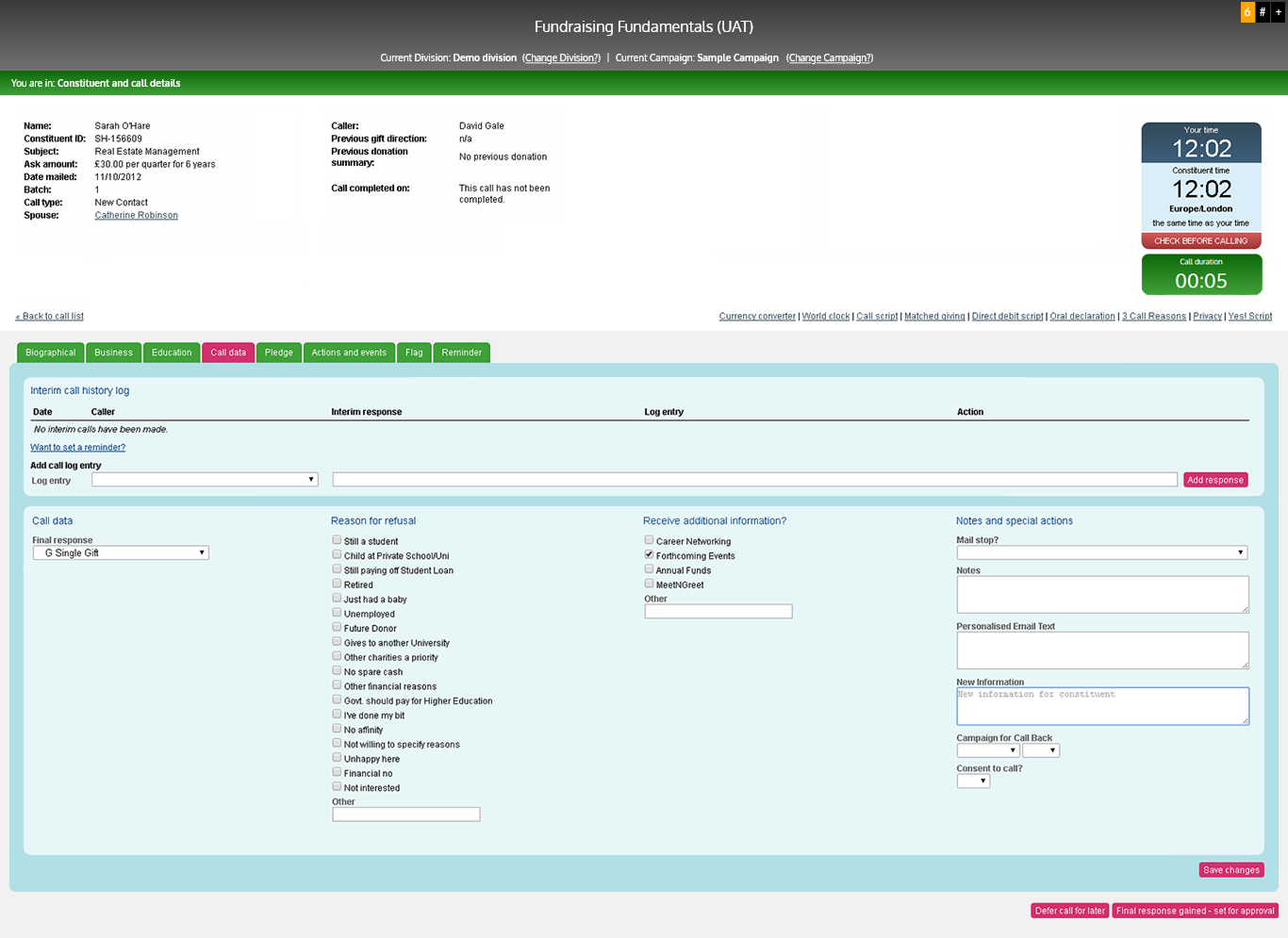
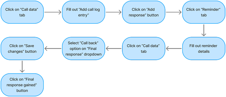
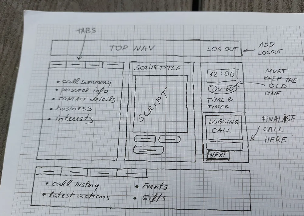
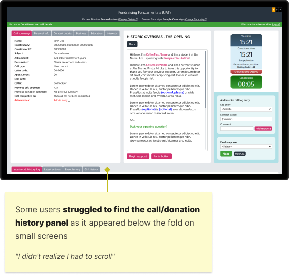
In user interviews, student callers described the call screen as complex, fragmented, and difficult to learn. Constituent information, call/donation records and call logging actions were described as “scattered all over the screen”, making them slow to find.
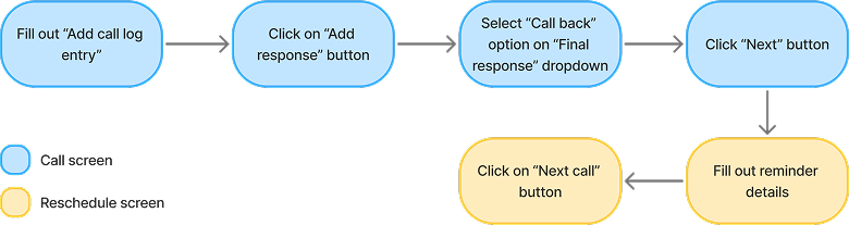
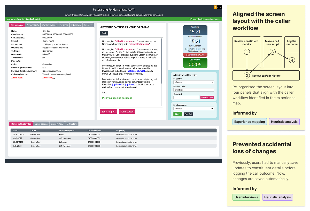
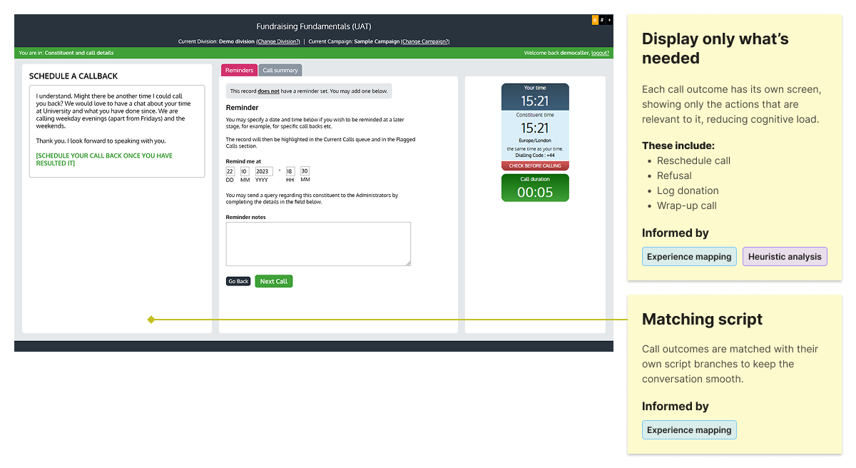
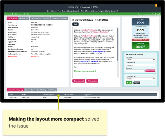
I streamlined user and task flows to reduce cognitive load and the number of clicks needed to complete tasks. I also reorganised the screen layout to better align with the caller workflow and restructured constituent information and call/donation logs to make them easier to scan.
Usability testing showed that the streamlined interface and automated on-screen scripting helped callers complete calls faster. After launch, the fundraising manager observed quicker onboarding for new student callers, alongside an estimated 20% increase in the number of calls completed each day during the new campaign.