Kristiana Druseiko

Design system for Coventry UK City of Culture

My role

UI Designer, responsible for:

  • Creating and managing a design system
  • Applying visual design to wireframes
  • Ensuring WCAG 2.1 compliance
  • Developer handoff
  • Visual Quality Assurance (QA)

Final product

Design system for an event website and loyalty scheme mobile app

Project team

  • UI Designer (me),
  • UX Designer,
  • External branding agency,
  • 3 separate development teams (comprising of front-end and back-end developers),
  • 2 QA Engineers,
  • Project Manager

Duration

Nov 2019 – Oct 2020

Project overview

After Coventry was named UK City of Culture 2021 (CCOC), the City of Culture Trust asked our company to design and build a website and mobile app to promote events and sell tickets.

As part of the team, I worked on UI design and created a design system, which ensured consistency across platforms and helped speed up development.

Objectives

  • Translate high-level brand guidelines into a functional UI system
  • Build and document a design system in parallel with product development
  • Support design system adoption by developers
  • Support collaboration between design, external branding, and engineering teams

The process

the-process

Creating the design system

Translating brand guidelines into UI design foundations

I met with the external team behind the branding to discuss their brand vision and how their brand assets could translate into digital UI elements. We agreed to expand the original three-colour palette to give us more flexibility in designing UI elements and establishing clear visual hierarchy.

Original brand palette

Expanded palette for building UI

Other foundations

Next, I used the brand guidelines to define other foundations. I created a type scale using the brand’s chosen font and selected an icon set that complemented their visual style. I also defined other core elements not covered by the branding, such as spacing, layout grids and elevation.

Click to expand

Applying visual design

While the UX designer led the creation of user flows and wireframes, I was responsible for adding look and feel to the wireframes.

My visual direction was guided by the high-level brand concepts provided by the branding team. Since the materials were all print-focused, I identified consistent visual themes and translated them into designs suited for functional user interfaces.

High-level brand assets (by branding team)

Wireframe (by UX designer)

Click to expand

Visual design (by me)

Click to expand

Building components and patterns in Figma

Once the initial designs were approved, I began assembling the first set of components and patterns, expanding the library throughout product development.

Click to expand

Creating documentation

Design tokens

Since the design system would be used for both a website and a mobile app, I collaborated with the development team to implement design tokens that would make the system scalable and easier to maintain.

Design token architecture we used

At the time, Figma didn’t support design tokens at all, so I created and maintained a spreadsheet to document the tokens for the development team.

Click to expand

Component & pattern documentation

I prepared detailed component and pattern documentation in Figma to support the developer teams during implementation.

Click to expand

Click to expand

Managing the design system

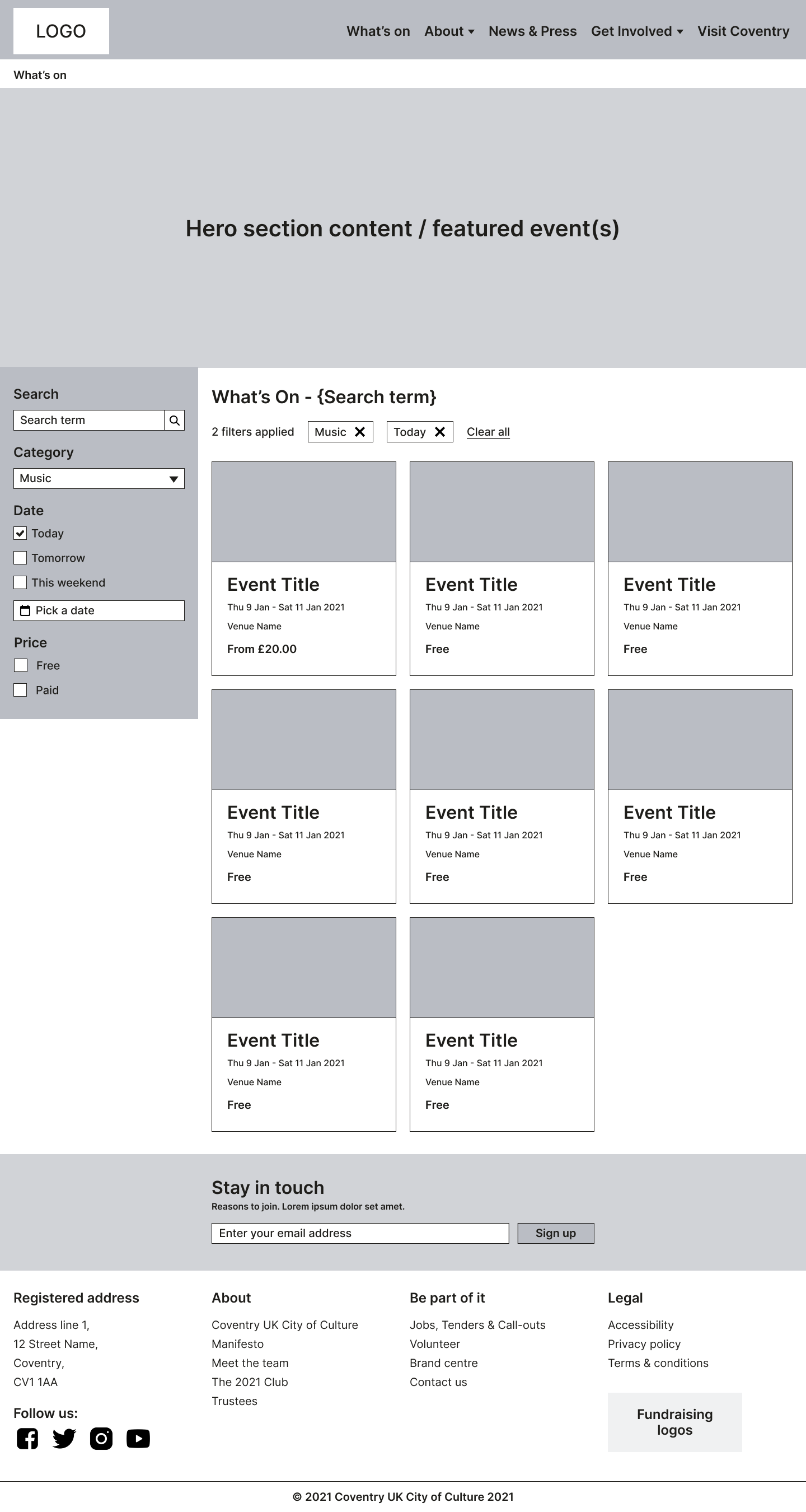
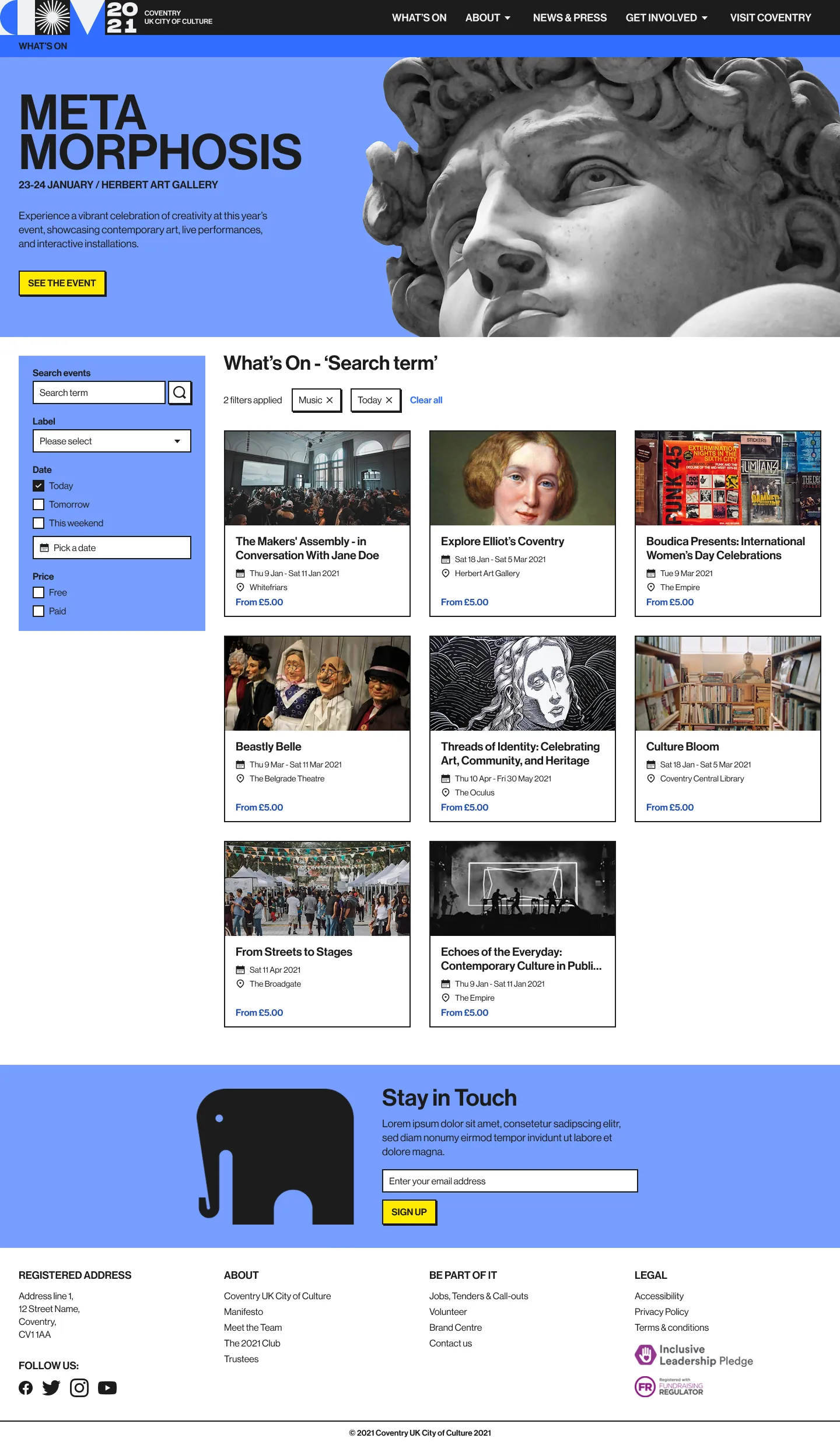
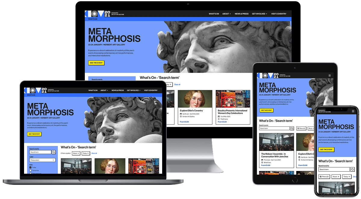
Developer handoff and collaboration

Involving developers early on

Designs were shared with developers early so they could provide feedback and voice any concerns about feasibility. This also meant that developers were already familiar with the designs at handoff which made the process more smooth.
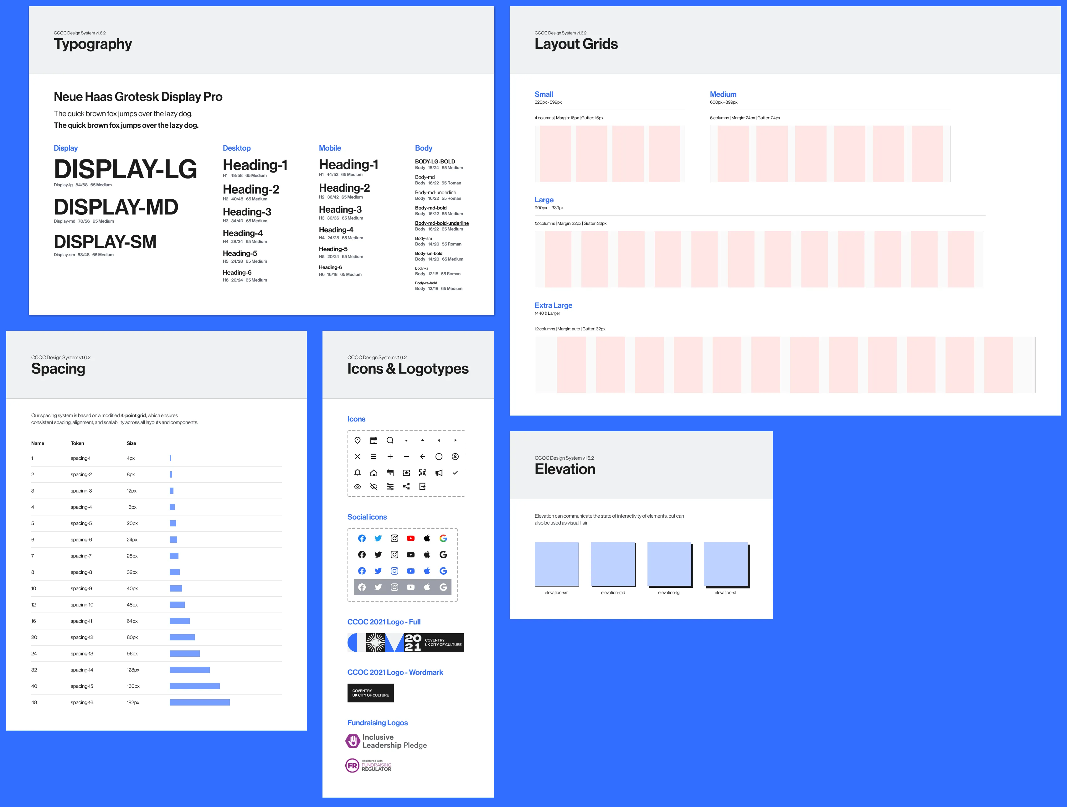
Handoff workshops

As new designs and components were signed-off, I ran handoff sessions to walk developers through updates in the Figma file, design token spreadsheet and design system documentation.

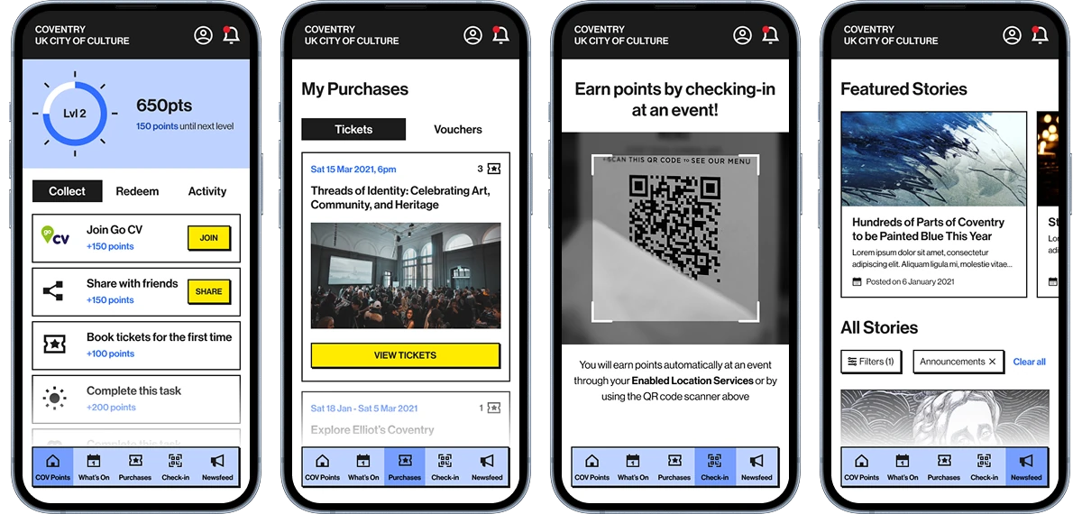
Taking part in visual QA

I participated in the Quality Assurance (QA) phase with the QA team to ensure implemented components matched the design system and documented any inconsistencies.

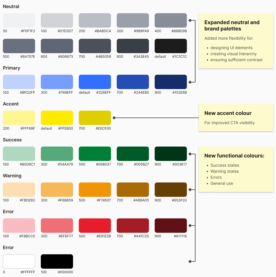
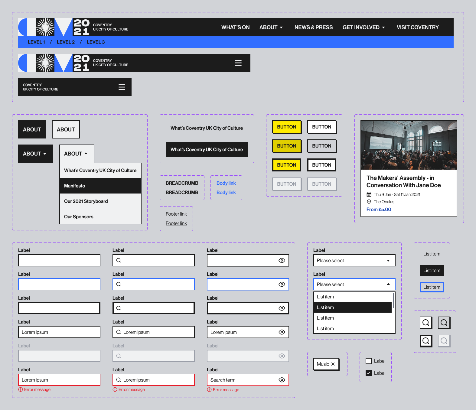
Improving and expanding the system

Collecting feedback

To improve the design system, I created a dedicated communication channel where designers and developers could raise issues or suggestions. This helped pinpoint and fix issues like missing documentation, designs not covering edge cases, and bugs.
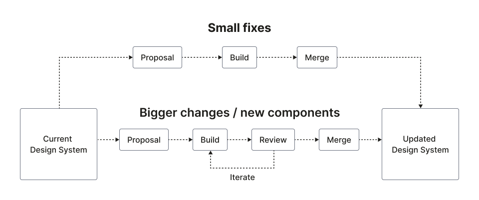
Contribution system

I suggested the contribution workflow below to allow team members to propose fixes or request new components. Small changes were usually added quickly, while larger updates went through review (and sometimes iteration) before being merged.

Project outcomes

Project team outcomes

The website, sign-on system, and mobile app were built by separate developer teams at different times, and the design system enabled fast onboarding. Developers reported that the token and component documentation I provided was helpful and easy to use.

The design system ensured consistency across the event website and loyalty scheme mobile app, reducing the need for rework and speeding up development as many components could be reused across the products.

Client’s business outcomes

The reduced development time allowed us to finish the website and mobile app ahead of schedule with plenty of time to spare, resulting in a smooth rollout. The brand consistency achieved through the design system helped strengthen the brand presence.

Because the system was built with flexibility and scalability in mind, it supported future products beyond the City of Culture year. For example, it was later reused by another team to build The Reel Store website. This saved the client time and effort since they didn’t have to start from scratch.

Products made with the design system

The CCOC event website

‘COV Points’ loyalty scheme mobile app