UX Designer, responsible for:
June 2021 – July 2024
Redress Manager is an internal tool used by financial institutions to manage customer compensation (redress) cases, typically in response to complaints, regulatory breaches, or service errors.
The software’s interface design had remained largely unchanged since its initial release in 1995. While it continued to serve its purpose, the technology had become outdated, limiting opportunities to improve its functionality, usability and accessibility.
The company set out to modernise the product by turning it into a SaaS solution.
My primary objective was to modernise the product’s UI, making it visually appealing, responsive, and scalable.
I also used this opportunity to uncover and address existing usability issues through a product audit and user research, ensuring the redesign improved user and business outcomes.
Usability testing confirmed that the redesign reduced cognitive load in core workflows, improving learnability and task efficiency.
I identified and addressed a major source of support tickets and user frustration. This was expected to reduce pressure on internal training and support teams after launch.
I helped establish a scalable, token-driven design system that enabled faster delivery and more efficient collaboration between designers and developers.
I spoke with key stakeholders to understand the goals for the product transformation and align the UX approach with broader business objectives.
Modernise the interface and overall experience to meet current usability standards and user expectations.
Ensure the new product is scalable and adaptable for delivery as a SaaS solution.
Ease pressure on the internal support team by improving usability and streamlining key workflows.
Changes to existing functionality should be kept to a minimum to avoid disrupting existing users and to reduce rework costs.
I conducted a detailed review of the legacy Redress Manager interface to understand its structure, workflows, and usability gaps.
What usability issues do case workers experience, and where are the biggest opportunities for improvement?
Direct access to external users was limited, so I used the research methods below to ensure design decisions were grounded in real user needs.
I had the opportunity to observe an on-site training session with a group of external users, which helped me identify challenges new users face and spot usability issues in action.
Users found the system visually dense and cluttered, making it appear more complex than it was and difficult to learn. Survey respondents often requested a cleaner, more modern interface.
All trainees regularly got stuck during the onboarding session and required assistance to progress, even for repeat tasks.
Errors and warnings appeared in pop-ups that disappeared once closed, and rarely explained what went wrong or how to fix it. Users often struggled to correct mistakes and believed the system had produced incorrect results.
Key insight: 42% of reviewed support tickets referenced error-related issues
Many buttons were unlabelled, reused identical icons for different actions, or behaved inconsistently across screens. Users relied on memorisation, user manual, or asking for help, and trainees frequently misclicked due to unexpected UI behaviour.
The legacy interface was visually dense and overwhelming for users. Using insights from the research, I redesigned layouts to make information easier to scan and reduce cognitive load.
All system feedback looked identical, so users couldn’t distinguish between warnings, errors, routine actions and critical steps.
Each message type has a clear, consistent visual style, reducing confusion and preventing mistakes.
Warnings and errors appeared only in pop-ups and disappeared once closed.
Warnings and errors now appear next to the relevant fields, supported by a persistent summary.
Users didn’t know which calculation tabs contained warnings or errors and had to check each one manually.
Tabs now display error/warning badges, guiding users directly to the issue.
I added interactivity to the wireframes in Figma and prepared a set of test scenarios. Participants were shown both existing and redesigned interfaces and asked to complete a set of tasks.
Access to external users wasn’t possible at the time, so I ran the tests with internal employees to gather proxy insights:
To reduce order bias, I counterbalanced the test by showing half of the participants the existing design first and the redesigned version second, while the other half saw them in the opposite order.
Users were shown multiple screens and asked to locate features and complete tasks (e.g. “Where would you save your work?”).
I measured:
Users were shown two screens containing errors and asked:
“This page contains errors. Can you locate them, and how would you fix them?”
I measured:
The system was documented in Figma, providing reusable elements and clear guidelines for designers and developers.
First, I defined the visual principles that form the system’s backbone, including typography, colours, spacing, shadows, icons, and layout grids.
I created reusable components and patterns in Figma and prepared detailed documentation to support the developer team during implementation.
I collaborated with the development team to implement design tokens that made the system scalable, consistent, and easier to maintain across future releases.
We used a three-tier token structure (primitive, semantic, and component-mapped) and added a fourth “responsive” tier to group values that would change across breakpoints in future (mobile, tablet, desktop).
I used Figma variables to structure colour, typography, border and spacing tokens and apply them to components. This meant that any future visual updates could be made globally with a single change.
The redesign wasn’t shipped before I left the company, so I didn’t have access to post-launch metrics. However, research showed a clear opportunity for impact.
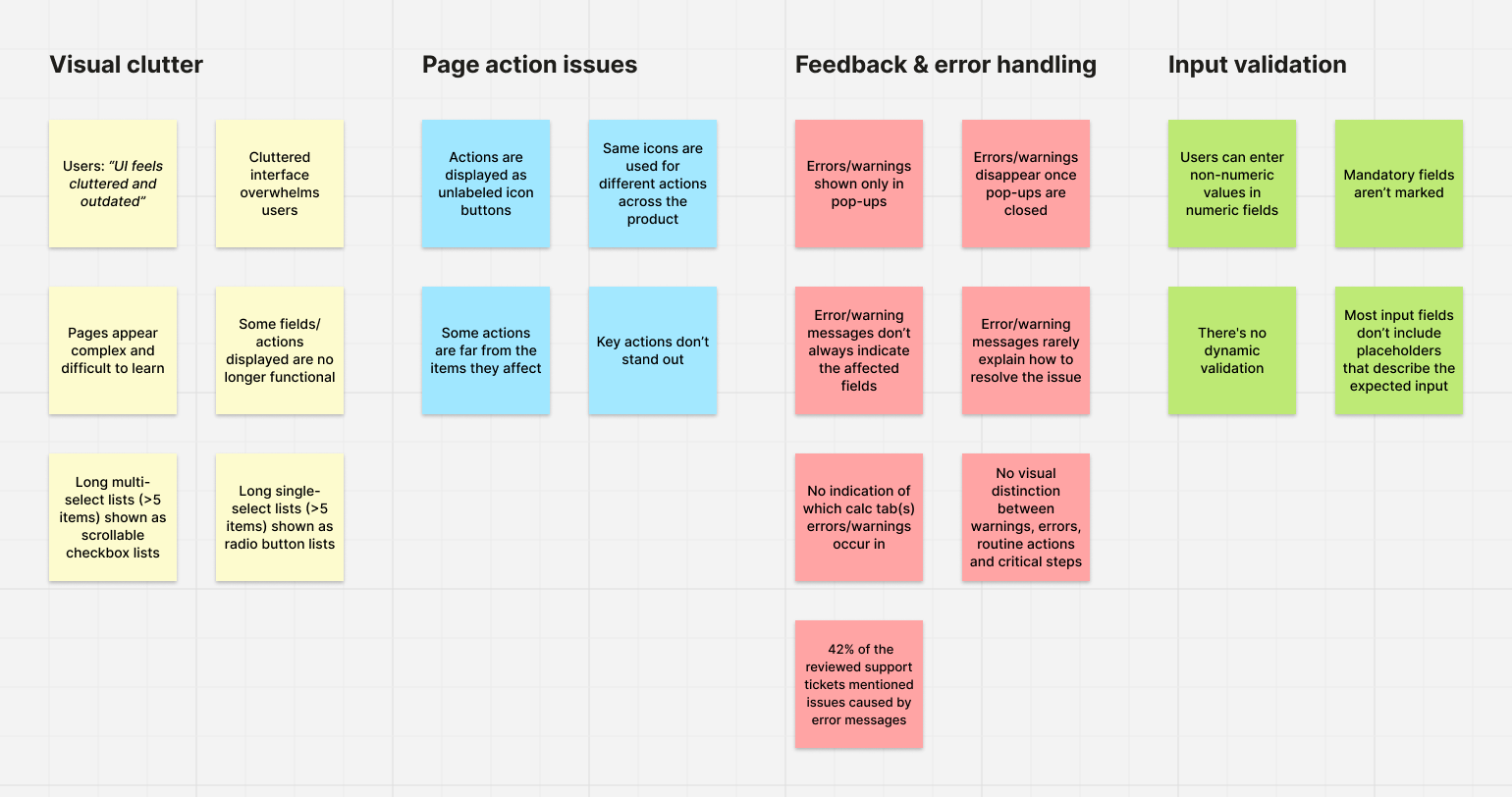
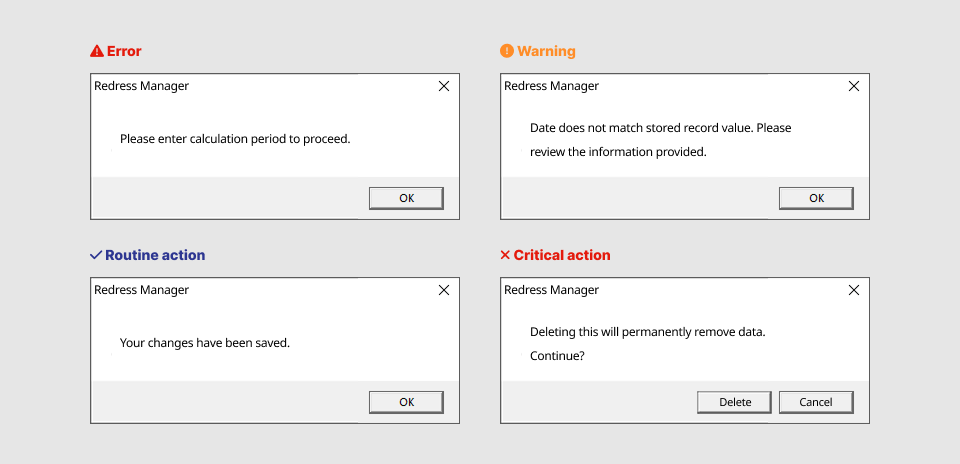
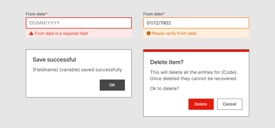
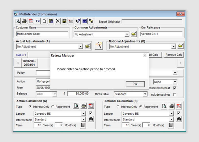
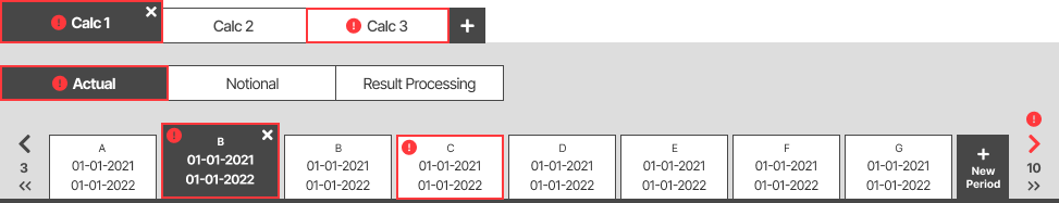
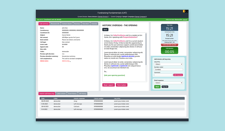
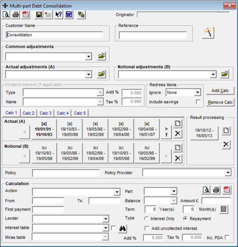
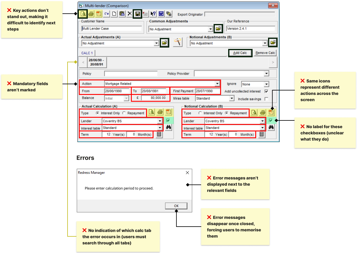
Error-related issues accounted for 42% of reviewed support tickets. Interviews and onboarding observations showed that users struggled to understand, locate and resolve errors.
The redesigned error handling addressed the root causes identified in user research. Usability testing on prototypes showed that new users could independently find and resolve all errors. This was expected to reduce confusion and lower the need for trainer and support team assistance.
If I were involved after the launch, I would measure success by a reduction in error-related support tickets and fewer trainer interventions during onboarding sessions.
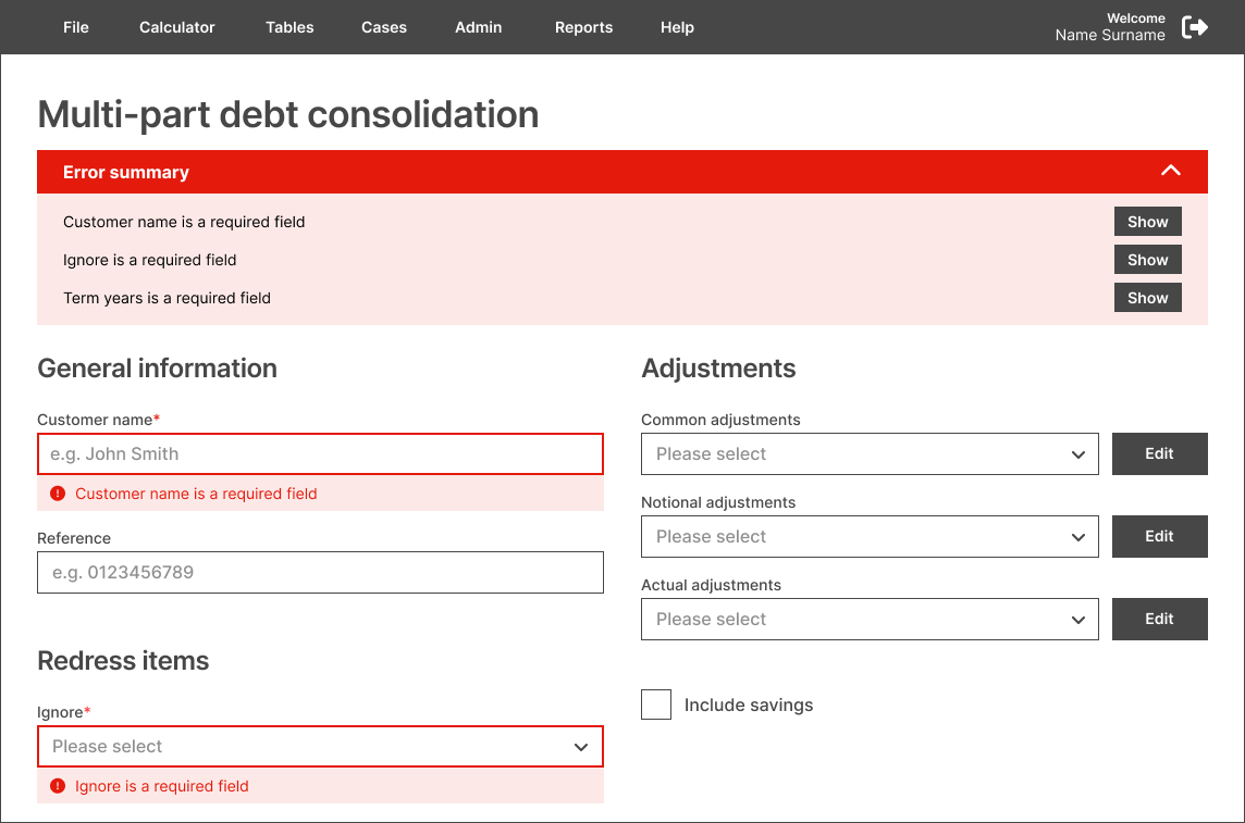
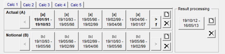
User research showed that visual clutter and inconsistent, unlabelled controls made the system harder to learn and navigate, increasing reliance on training and support.
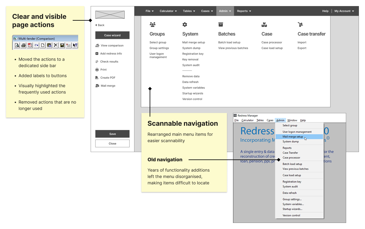
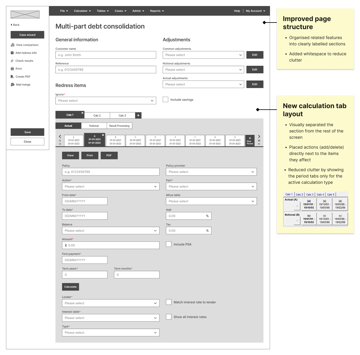
I redesigned the screen layouts to reduce clutter, clarify structure, and make actions easier to find and understand. Usability testing confirmed that users could locate information and complete tasks more efficiently, and that the changes didn’t disrupt experienced users.
If I were involved after the launch, I would continue validating the redesign by testing complete end-to-end workflows on the fully-functional product. This would provide me with more realistic efficiency and learnability measurements.
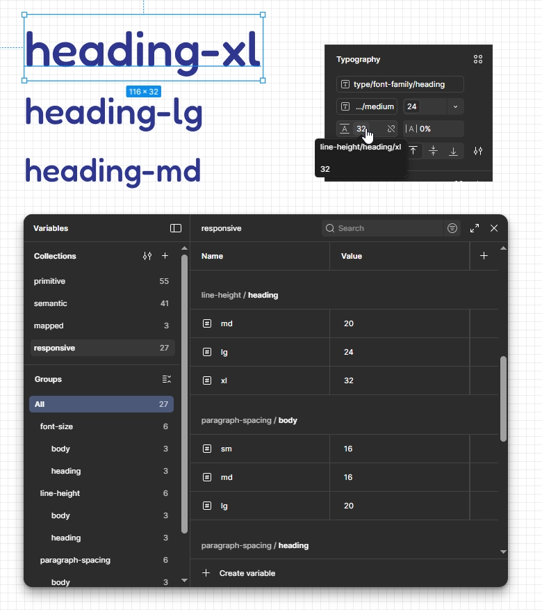
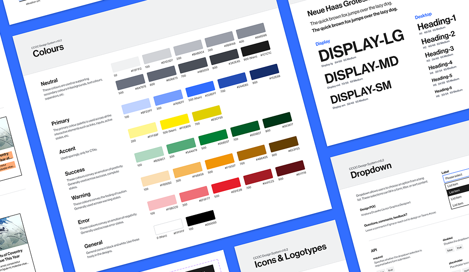
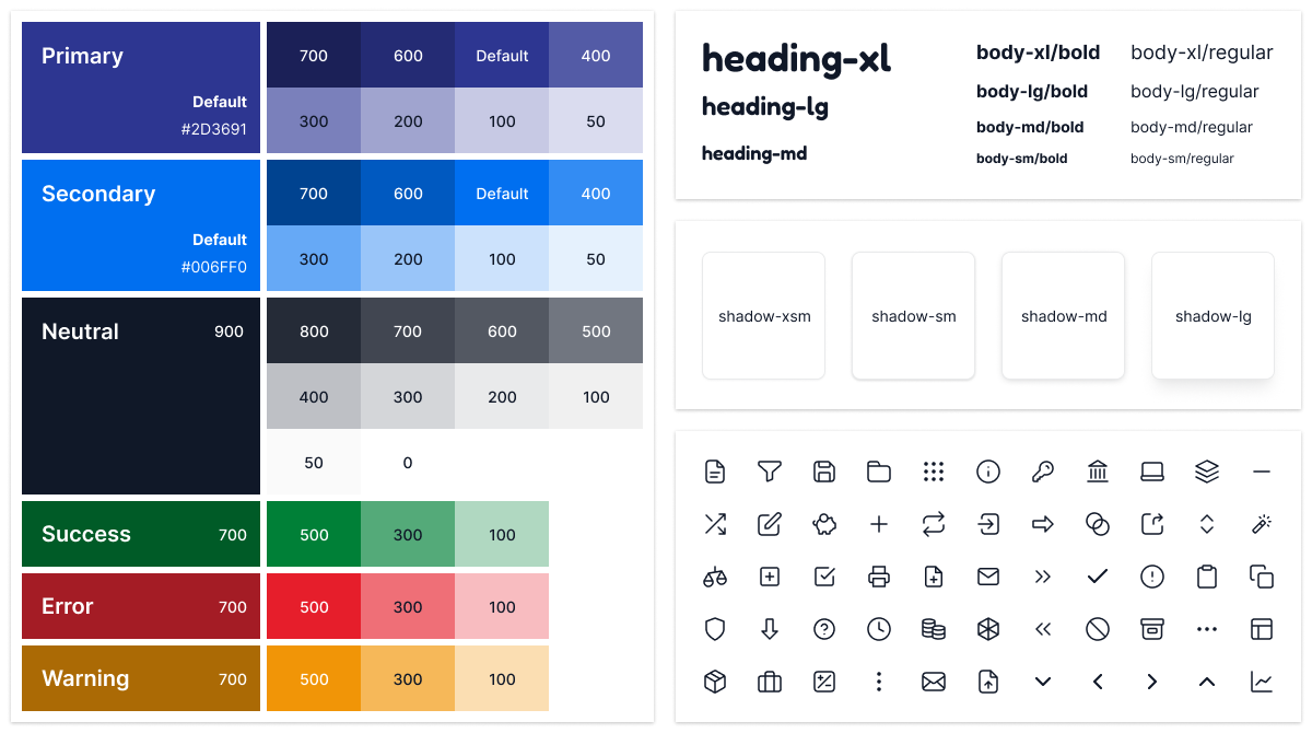
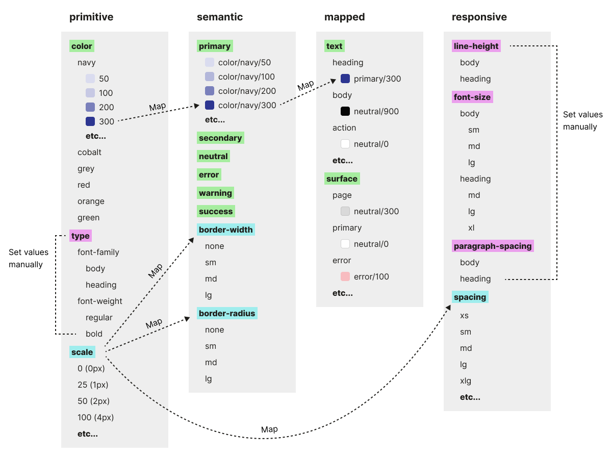
I helped establish a design system to modernise the UI, ensure consistency, and support future scalability. It included foundations, design tokens, reusable components and patterns, with detailed documentation to streamline developer handoff and accelerate delivery.